
BRB is a bank in Brasilia where the majority of account holders are civil servants. In 2020, in partnership with Clube de Regatas Flamengo, a digital bank was created to expand the BRB brand nationally. The partnership with Flamengo has proven to be fundamental for BRB’s insertion in the digital world and has contributed to strengthening the relationship with our customers and creating personalized identity products and unique experiences has been fundamental to the success of the partnership.
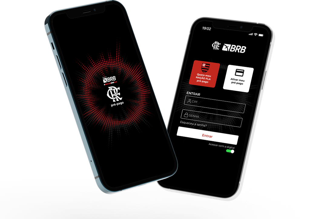
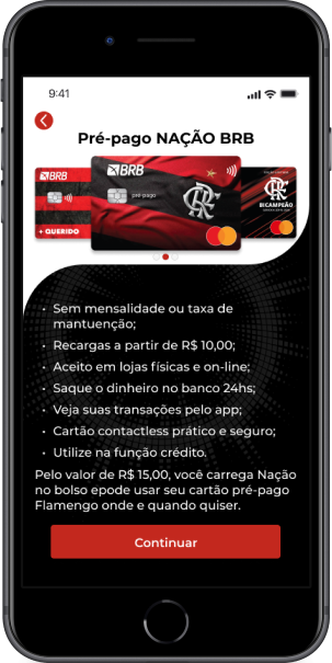
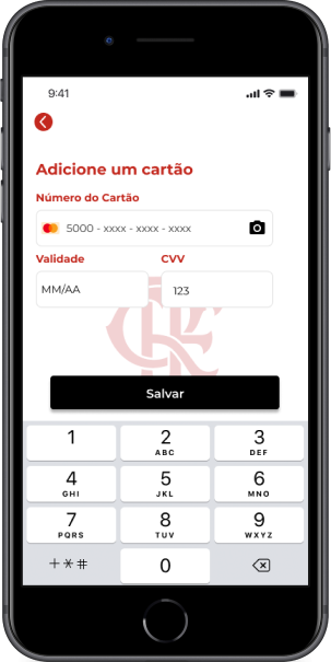
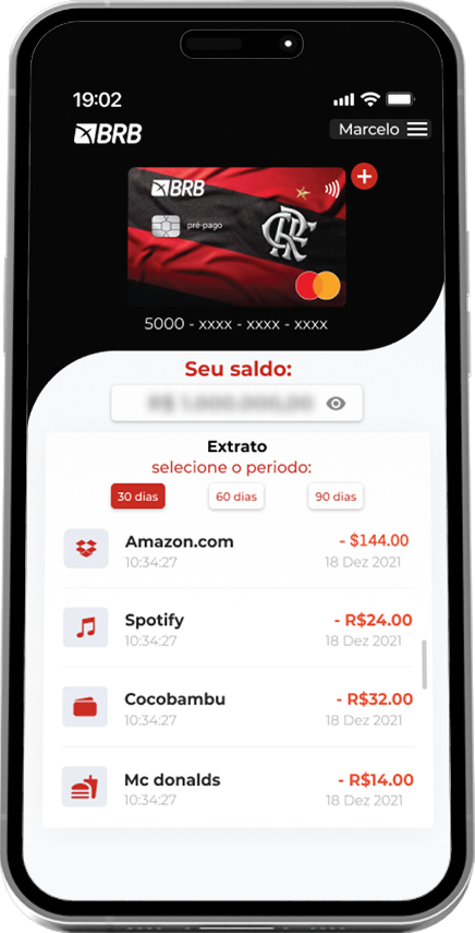
The goal of the project was to design an app of the new bank Nação BRB Fla of Clube de Regatas Flamengo for pre-paid cards.
Scope
- Wireframes
- Flowcharts
- UX Research
- User Interface
- Prototyping
My Role
- Product Design
Team
- Marcelo Lima – Product Designer
- Andreia – Product Manager
- Fernando – Marketing Manager
- Aurelio – IT Manager
The Challenge
In the discovery phase, we raised some insights that would directly impact the project’s KPIs. We decided to create a smart, fast and mostly useful app. Therefore, we take initiatives such as:
• Automation of trivial processes;
• Offer products and services at strategic moments of the day;
• Multiple payment of slips;
• Reformulation of the service infrastructure;
• Redesigning the customer journey.
• Implementation of recharge via PIX.
• Financial education functionality;
• Constant receipt of feedback for the evolution of sprints.
• Creation of a prepaid card for young people.
Research
62
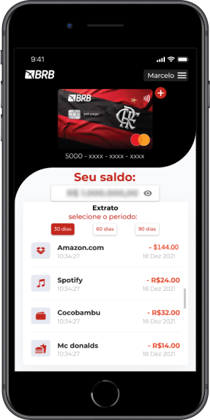
In the research with users, it was evidenced that 62% of the public use prepaid cards to make purchases in internet stores, supermarkets.
20
of users are parents who save money for their children and thus educate them to have financial control through the application and manage their purchases, thus having a little financial independence.
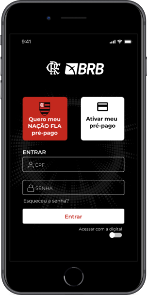
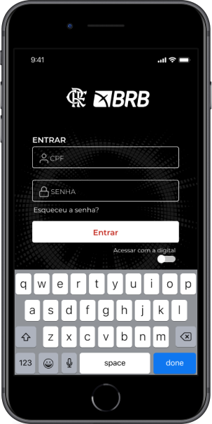
Solution
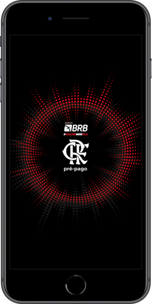
a user-friendly application, with fluid and easy-to-understand navigation, with the predominant colors of the Flamengo team for greater identification and acceptance by the general public.
Colors & Material
Black
#0000
Red
#c3281e
Gold
#cdaf41
Typography
Montserrat font Family
A B C D E F G H I J K L M N O P Q R S T U V W X Y Z
a b c d e f g h i j k l m n o p q r s t u v w x y z
Curiosities
In 2021, we experienced a surge in user numbers. At the project’s outset, we had 100.000 users, and within 6 months, this figure had dramatically risen to 1 million. The rapid adoption and acceptance of the new platform resulted in over 2 million users in just over 3 months. This marked growth was a significant milestone and provided valuable insights for the project.

Learnings
Initially, we started with a very innovative interface, following many references from the fintech industry, but in interviews with users we realized that some features were very playful and not so obvious. It was at that moment that we took a step back and started with simpler and more fluid actions, since 40% of the clients were over 60 years old and belonged to classes C, D, E.
Limitation of technology and instability in the database was one of the lessons learned for the proper functioning of the application